The problem for me is not whether Campbelltown Council’s new logo design is good or bad.
For mine, it was always about why do it in the first place.
Why spend so much money and effort on something that Blind Freddie could tell you wasn’t going to give much in return – if anything.
Not sure how logos started, but it’s like someone added a logo to their public identity and eventually everyone else thought, well, that seems like a good idea, let’s all have logos.
But think about for a moment all the logos you could actually recall, whether it’s a council, a charity or a company. And if any of them drive you crazy with desire to buy their products or invest in their area.
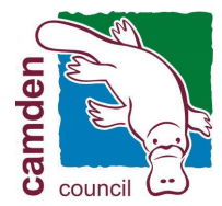
I tried to remember logos of councils I have covered and eventually remembered the platypus on Camden’s.
That’s it: one from about a dozen.
You could argue, without any fear of being contradicted, that having a logo only benefits the consultants who produce and design it for you.
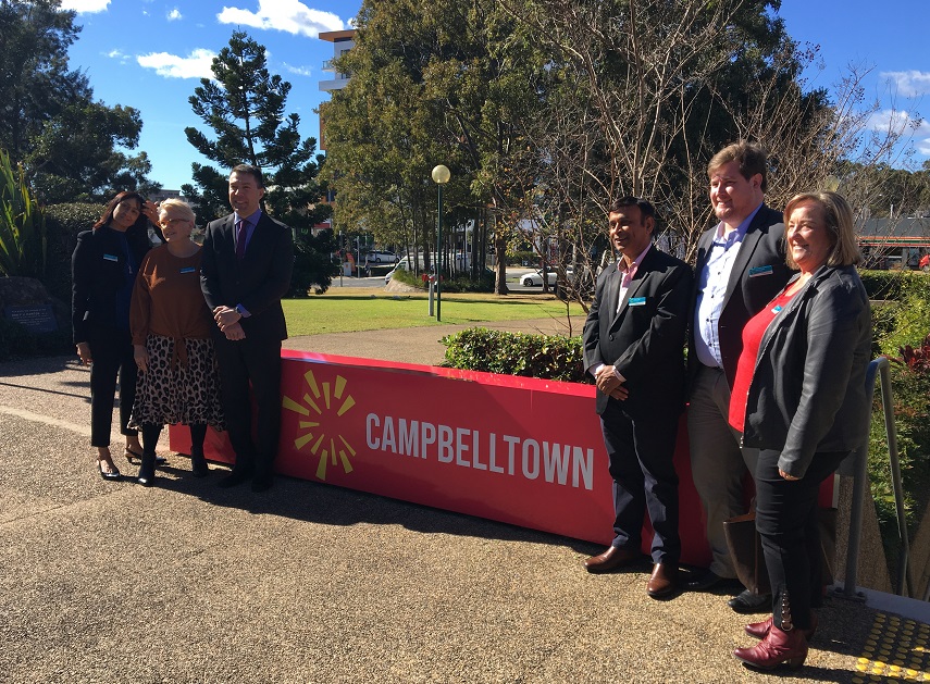
In this case, it cost $350,000 to hold workshops after workshops with various stakeholders to come up with a new logo as part of a branding re-imagining of Campbelltown Council.
Most of the people who attacked the logo on social media just didn’t like the design.
Some said it reminded them of a giant American hamburger chain (they’re not getting a free plug here) or China’s flag and so on.
Very few focused on the real issue, which is: what was the point of changing the logo or even having a logo?
Short answer: there was no point, other than the leadership of council making themselves look like they were doing something and, secondly, enriching more North Shore and Eastern Suburbs consultants.
The current council doesn’t need consultants to tell it what its priorities should be, including wasting our hard earned ratepayers’ dollars on logos.
Apart from making sure it picks up the rubbish, collects the rates and fixes the potholes on our local roads, this council should make a much bigger effort to be transparent with the residents.
There are several issues where this has not been the case over the past three years.
One of these is telling ratepayers why the council has been spending millions of dollars on consultants during this period, what it was for and were were the benefits, if any.
With an election less than a year away, it may be a good idea to start sharing some of this information with the ratepayers/voters.
That’s much more important than worrying about what a logo looks like.
You make a fair point, regarding cost.
I recall when “University of Western Sydney” decided to change its name to “Western Sydney University”, the cost of replacing signs, logo, stationery etc was estimated to be $20 million. Not much cost/benefit there either.
As far as Campbelltown is concerned, I did not realise – until someone pointed it out – that the logo is actually supposed to be a “C”. I suppose it is if you stare at it long enough.
OF COURSE YOUR RIGHT ERIC THERE’S AN ELECTION NEXT YEAR SO WHY NOT CHANGE THE COLORS TO LOOK LIKE THE ALP TICKET